Introduction
The Form Builder is a powerful tool that allows you to create custom forms for collecting data from your users. This guide will walk you through the process of creating, customizing, and publishing forms.Getting Started
Creating a New Form
- Navigate to the Forms section in the sidebar.
- Click the “Create Form” button.
- Enter a name for your form in the “Name” field.
- Add an optional description to provide context for your form.
- Select the visibility option:
- Private: Only members of your organization can access the form
- Public: Anyone with the link can access the form
Building Your Form
Adding Elements
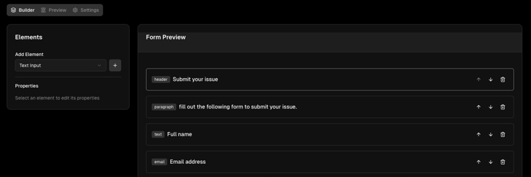
- Navigate to the “Builder” tab (selected by default).
- From the left panel, select an element type from the dropdown:
- Text Input: For collecting short text responses
- Email Input: For collecting email addresses
- Number Input: For collecting numerical data
- Checkbox: For yes/no or agreement questions
- Dropdown: For selecting from a list of options
- Radio Group: For selecting one option from a list
- Text Area: For collecting longer text responses
- File Upload: For collecting files
- Header: For adding section titles
- Paragraph: For adding explanatory text
- Divider: For visually separating sections
- Click the ”+” button to add the selected element to your form.
Organizing Elements
Each element in your form can be:- Moved up: Click the up arrow button to move an element higher in the form
- Moved down: Click the down arrow button to move an element lower in the form
- Removed: Click the trash icon to delete an element from your form
Configuring Elements
- Click on any element in the canvas to select it.
- The properties panel on the left will update to show options for that element:
- ID: A unique identifier for the element (used when processing form data)
- Label: The text shown to users above the input field
- Placeholder: Example text shown inside the input field
- Required field: Toggle this checkbox to make the field mandatory
Working with Options (Dropdown and Radio Group)
For elements that have options (Dropdown and Radio Group):- Select the element in the canvas.
- In the properties panel, you can:
- Choose from predefined option sets (Yes/No, Days of Week, Months, etc.)
- Add custom options by clicking the “Add” button
- Clear all options by clicking the “Clear” button
- Edit option labels and values individually
- Remove specific options using the trash icon
Previewing Your Form
- Click the “Preview” tab to see how your form will appear to users.
- The preview shows all your form elements as they will appear when published.
- You can interact with the form elements, but submissions are disabled in preview mode.
Form Settings
- Click the “Settings” tab to configure your form’s general settings.
- Here you can modify:
- Form name
- Form description
- Visibility (Private or Public)
Saving Your Form
- Click the “Save” button in the top-right corner to save your changes.
- A success notification will appear when your form is saved successfully.
Publishing Your Form
- Once your form is ready, click the “Publish” button in the top-right corner.
- Publishing makes your form accessible to users according to your visibility settings.
- You can unpublish the form at any time by clicking the “Unpublish” button.
Sharing Your Form
After publishing your form:- A form link will appear at the top of the page and in the Settings tab.
- Click the “Copy” button to copy the link to your clipboard.
- Share this link with your intended audience.
- Note: If your form is set to “Private,” only members of your organization can access it.
Working with Form Submissions
When users submit your form:- The data is collected and stored securely.
- If the form is connected to a workflow, the submission will trigger that workflow.
- Form data is passed as variables to the workflow, with each field’s ID as the variable name.
- You can access and manipulate form data in your workflows using Orka Expression Language (OEL).